Hi!
Last week I worked on the different states of Mermaid River and the one artifact that I will write about this week is the Title screen.
The title screen is the first thing you encounter as the game is started. This is where the player gets to choose between starting the game, looking at the high score screen or exiting the game. These options however; is not for me to implement. The work that I have done concerns the picture that contain the options, displays the name Mermaid River and gives a hunch of what kind of game that is about to be played.
The biggest challenge that I faced was to make the screen represent the games art style and concept. To make it look alike the game I started off by using the colors and shapes that it contained. I soon realized that these colors were to pale to make the screen interesting enough. The title screen should work as a logotype, it should pop out and be noticed. I chose to step outside the borders of the color theme and expanded both the darker and lighter values, rendering a much more colorful and eye-popping result.
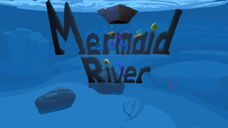
I do like the result but even though the disconnect is minimal between the game and title screen it does bug me somewhat. ![]()


When making the screen I had the old title screens of NES in mind like Mega Man and The Legend of Zelda.
The one thing that differs is that all those games had their letters tilting upwards . I did not notice that until after the creation of the screen :(, but I still think that it works out.
To make the ”Mermaid River” letters I first draw out the outlines in 2d, then I temporarily placed them on bottom of the frame and used the perspective transform to make them tilt. Afterwards a vanishing point was drawn at the point that I estimated the letters to be facing. The vanishing point was then used to extrude the letters in its direction. From there it was all about the sculpting of different rocky patterns. I chose the rocky material because of its solid appearance and the fact that it is an object that appears allot in the game. Somewhere along the road I tried out making the letters with different fish, an idea that got thrown away early on.
The title screen was made for the beta so it will do for now but until the final I expect to insert more content like perhaps more seaweed and maybe even a threatening swordfish.
Bye bye!
– Nils

Extremely good job this sprint, your game really seems to be coming along!
I like the fact that you took your time to explain where you encounter this artifact and why it’s important for it to exist and why.
The fact that you took a gamble and went outside of the normal colour scheme was a bold move, a move which seems to have paid off. The title pops out and is easy on the eyes but still iconic enough to be recognizable.
I actually liked the down tilt angle makes the letters feel like they are floating, but maybe they are a bit to evenly angled for that. You mentioned a disconnect but didn’t fully elaborate exactly what you meant with that
Now I’m not sure if this is an intentional design choice or maybe I’m just being picky, while I love the down tilt angle, there seems to be some logic missing behind it as you can see the surface from below but the letters from the top. This makes me question the perspective a bit. This isn’t something that is really noticeable however as I only realized it after staring at the screen for too long.
You didn’t go that indepth with how you did the screen, I would’ve loved to be able to read some more. But other than that time is almost up and the day of the final is approaching, good luck! You’ve done an exceptional job up until now.
GillaGilla