Hi! The Beta deadline is getting closer and our group is set on implementing all the assets needed. In this days post I am going to write about the process of making the HUD for Mermaid River. The elements that the group had decided should be in the HUD was:
- Health bar
- Air meter
- Scoreboard
- Power up (shows if a power up is activated)
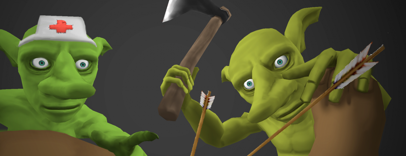
Previously our HUD was built up by two rectangular bars for health, air and a scoreboard. A problem we had with this HUD was that it didn’t explain itself well to the player or notify the player when health or air was lost. To explain what was going on I wanted to make a doom-like display of the character were you could see the condition of the avatar and relate it to the actions of the bars.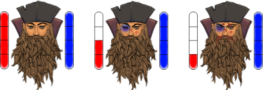
In the picture above you can see how the avatar reacts to the reduction of the Health bar. 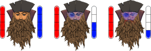
Here the reduction of the Air meter and its effect on the avatar is displayed (The scars is not added from loss of air as in the picture, the only change is in the blue color).
As for explaining itself better I think the health bar and air meter now works out pretty well. On the other hand, the playtesting for the pre-beta version clearly showed us that it still did not notify the player enough. In the future work including the HUD I will make the bars lager and implement flickering lights as feedback when the meters and bars change.
The HUD also needed to contain a scoreboard and a power up display. First of when I started the designing of the scoreboard I searched for a way to make it pirate like. And I thought to myself – “Pirates, they like ships.” So then I started sketching on ways to make a pirate ship with a score attached to it. The results that I got did not satisfy me and the logic of scribbling score onto a ship felt nonexistent, I trashed this plan and started over. This time around I wanted to make it fit to the Avatar as the Doom-like avatar did. The avatar has had both of his legs cut of and replaced with wooden oars. These now should provide as scoreboard. I liked the idea that the avatar keeps his score by markings on these new wooden legs.
The power up bar became a flipped version of the scoreboard, this solved a problem I had with making the HUD centered.
The Score and Power up boards.
-Nils Folker

First off I must say that I’m a huge fan of the Doom-esque HUD portrait that you chose to adopt, it really gives the player immediate (if maybe somewhat fuzzy) feedback on how well their character is doing. Nice touch.
Now, you describe your previous HUD elements and that they didn’t work out. I would recommend putting up an image of what they look like to make it easier to understand what you mean.
Next, I’m a little uncertain about what the entirety of your HUD will look like in-game, and since this post is about making it easier for the player to see and make sense of it, I thought we’d dive into that for a bit.
I’m led to understand that the health bar, portrait and air bar will be located in the centre of the screen. Is it the top or bottom part? That is one variable that will affect whether the player will notice a change or completely miss it.
And where is the scoreboard oar and power-up oar located? To the sides? Directly? Or really out on the edges?
Images, even crappy, hand-drawn scribbles would help immensely.
I do like the inclusion of a portrait showing the avatar’s face and condition, though I would recommend removing the black-eye from the ”damage slider”, and focus on red colours for damage and blue colours for asphyxiation (since they are the colours on the respective bars representing these traits).
I also find the reasoning behind the design of the scoreboard and power-up visuals to be plausible and somewhat amusing. It makes sense for the character to keep score on something that isn’t affected by water, and the fact that this thing is part of the character’s body while also being a decorative piece appeals to me.
I also agree that adding an eye-catching effect to the bars when they change is a good idea.
Well, I guess that wraps up my comment. Hope to see good things from you and your team!
GillaGilla
Hey! A HUD is an important, if not THE most important aspect of a game. You make it very clear what your HUD needed to make it work. You explain how your previous HUD looked, but since I am a philistine I would really like to see a ‘’before’’ and ‘’after’’ comparison image. I really like the effects you have on both the health bar and the air bar, it really reminds me of B.J. Blazkowicz from Wolfenstein, nice touch. It’s interesting to read about the feedback you received during pre-beta testing and how you plan to amend them.
It makes a lot of sense making the elements of the HUD pirate themed. But, like you said, a ship does not seem very slick. Again, it would be nice to see a picture of the idea, even if it was scrapped. The oars would probably have worked on their own, but connecting it to the avatar, with his legs, is a brilliant idea. I also like the visuals on the scoreboard and the power ups, the power ups in particular. I can not put it into words exactly, but the green glow around the icons feel very slick, fitting etc.
Great work, and good luck in the rest of your project!
GillaGilla